Typical navigation bar / tabs
A navigation or menu bar is a bar made up of tabs. “Behind” each of those tabs is a link -to a post page, a static page, a label page, to another website etc. Making navigation tabs is not that difficult. They are basically links with some styling added for visual appeal. While links are arranged vertically, navigation tabs are usually arranged horizontally.
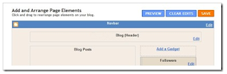
In this tutorial we will install the bar just below the header, a typical place for navigation bar. The bar will be added as a gadget via Page Elements page. The advantage of using a gadget is that if you want to remove it later on, it can be done easily without editing the HTML.
But in order to do that, the template must have an Add A Gadget link thingy or widget container as I would call it, at that particular location. In template as with most other templates, there is no such element,
No Add A Gadget to hold the widget/gadget
what do we do then? you must create it.
Step 1. Adding an Add A Gadget
Adding a Add A Gadget is done in your template HTML.
- Go to Dashboard > Design > Edit HTML.
- Back up your template.
- Look for the following lines (or something similar) in your HTML code:
<div id='header-wrapper'>
<b:section class='header' id='header' maxwidgets='1' showaddelement='no'>
<b:widget id='Header1' locked='true' title='YourBlog Title(Header)' type='Header'/>
</b:section>
</div>
Right under it, paste this code:
<!--Navigation page element starts -->
<div id='navibar-wrapper'>
<b:section class='navibar_section' id='navibar_section' showaddelement='yes'/>
</div>
<div style='clear: both;'/>
<!--Navigation page element ends -->
Add A Gadget to hold the widget/gadget
Step 2. Adding in the tabs
- Go to Layout > Page Elements sub tab.
- Click Add A Gadget link below the header.
- Scroll down the Add A Gadget window and select HTML/Javascript.
- Leave the title box empty.
- Copy and paste the HTML code below into the content box.
<!-- Navigation tabs start -->
<div id='navibar'>
<a href="YourLink1" class="navitabs" title="TooltipText1">ButtonText1</a>
<a href="YourLink2" class="navitabs" title="TooltipText2">ButtonText2</a>
<a href="YourLink3" class="navitabs" title="TooltipText3">ButtonText3</a>
<a href="YourLink4" class="navitabs" title="TooltipText4">ButtonText4</a>
<a href="YourLink5" class="navitabs" title="TooltipText5">ButtonText5</a>
<div>
<!-- Navigation tabs end -->
- Replace:
YourLink with the URL of your destination page or site.
a) You can get the URL of a page by copying the content of your browser’s address/URL bar while you are on that page.
b) To show all posts under a label (category), you need to link to the label’s page. You can construct the URL to the page (i.e. label URL) by following the format below:
http://YOURBLOGNAME.blogspot.com/search/label/YOURLABEL
c) For a multiple word label such as "YOUR LABEL", you need to replace the space between words with %20, like so: YOUR%20LABEL.
d) And one more thing, labels are case sensitive.TooltipText with the text you want to appear when you hover the button.ButtonText with the text you want show on each button.
- Click Save.

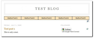
A functional navigation tabs, before styling
Step 3. Styling the tabs.
Go back to Dashboard > Design > Edit HTML. Find this line of code in your template:
]]></b:skin>
Copy the code below and paste it immediately before (above) that line.
/* Navigation tabs start */
a.navitabs, a.navitabs:link, a.navitabs:visited {display:block; width:150px; height:25px; background:wheat; border:1px solid black; margin-top:2px; text-align:center; text-decoration:none; font-family:verdana, arial, sans-serif; font-size:12px; color:black; line-height:25px; overflow:hidden; float:left;}
a.navitabs:hover {color:white; background:olive;}
#navibar {width:760px; margin:0 auto;}
/* Navigation tabs end */
The finished product
Step 4. Customizing
- Change the colors, height etc. to suit your taste.
- You can add or reduce the number of tabs. Do it in Step 2, each line of code (line 3 to 7) corresponds to a tab.
- To change tab width, change the value in Step 3 line 1.
- Changing the number of tabs and/or tab width will make the bar off-centered. To keep it at the center, you will have to change the container width in Step 3 line 4. The width should be equal to the sum of all tab widths (including left and right margins).
- You can move the bar to the top of the header if you want,
- In Step 1 no. 3, inside the header widget, change
locked='true' to locked='false'
- Drag & drop the corresponding gadget in Page Elements page.
Step 5. Enjoy !


 Posts
Posts